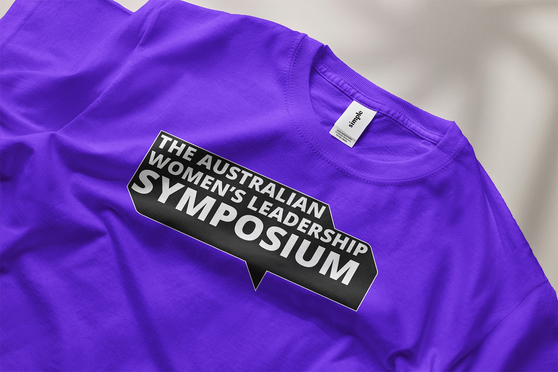
Symposium rebrand
Symposium rebrand
Symposium rebrand
A bold identity for a platform built on dialogue, leadership, and community.
A bold identity for a platform built on dialogue, leadership, and community.
A bold identity for a platform built on dialogue, leadership, and community.
Branding
Branding
Branding
Web design
Web design
Web design
Communication
Communication
Communication
From a Gathering to a Movement
From a Gathering to a Movement
From a Gathering to a Movement
The Brief
The Brief
The Brief
The Women’s Symposium began 15 years ago as a modest gathering. Over time, it has grown into a national platform for reflection on leadership for women and gender diverse people.
The Women’s Symposium began 15 years ago as a modest gathering. Over time, it has grown into a national platform for reflection on leadership for women and gender diverse people.
The Women’s Symposium began 15 years ago as a modest gathering. Over time, it has grown into a national platform for reflection on leadership for women and gender diverse people.
With its expanding reach and increasingly ambitious programming, the Symposium needed a visual identity that could reflect its evolution. One that felt cohesive, impactful, and ready to scale.
With its expanding reach and increasingly ambitious programming, the Symposium needed a visual identity that could reflect its evolution. One that felt cohesive, impactful, and ready to scale.
With its expanding reach and increasingly ambitious programming, the Symposium needed a visual identity that could reflect its evolution. One that felt cohesive, impactful, and ready to scale.


Where Voices Meet and Momentum Builds
Where Voices Meet and Momentum Builds
Where Voices Meet and Momentum Builds
The Idea
The Idea
The Idea
At its core, the Symposium is about exchange of ideas, perspectives, and leadership journeys. The rebrand captures this with a single visual thread: the speech bubble.
At its core, the Symposium is about exchange of ideas, perspectives, and leadership journeys. The rebrand captures this with a single visual thread: the speech bubble.
At its core, the Symposium is about exchange of ideas, perspectives, and leadership journeys. The rebrand captures this with a single visual thread: the speech bubble.
It’s a shape rooted in conversation and rich with expressive potential. Flexible, inclusive, and vibrant, it became the central motif to express the diversity, emotion, and energy of the event.
It’s a shape rooted in conversation and rich with expressive potential. Flexible, inclusive, and vibrant, it became the central motif to express the diversity, emotion, and energy of the event.
It’s a shape rooted in conversation and rich with expressive potential. Flexible, inclusive, and vibrant, it became the central motif to express the diversity, emotion, and energy of the event.


Making the world know
Making the world know
Making the world know
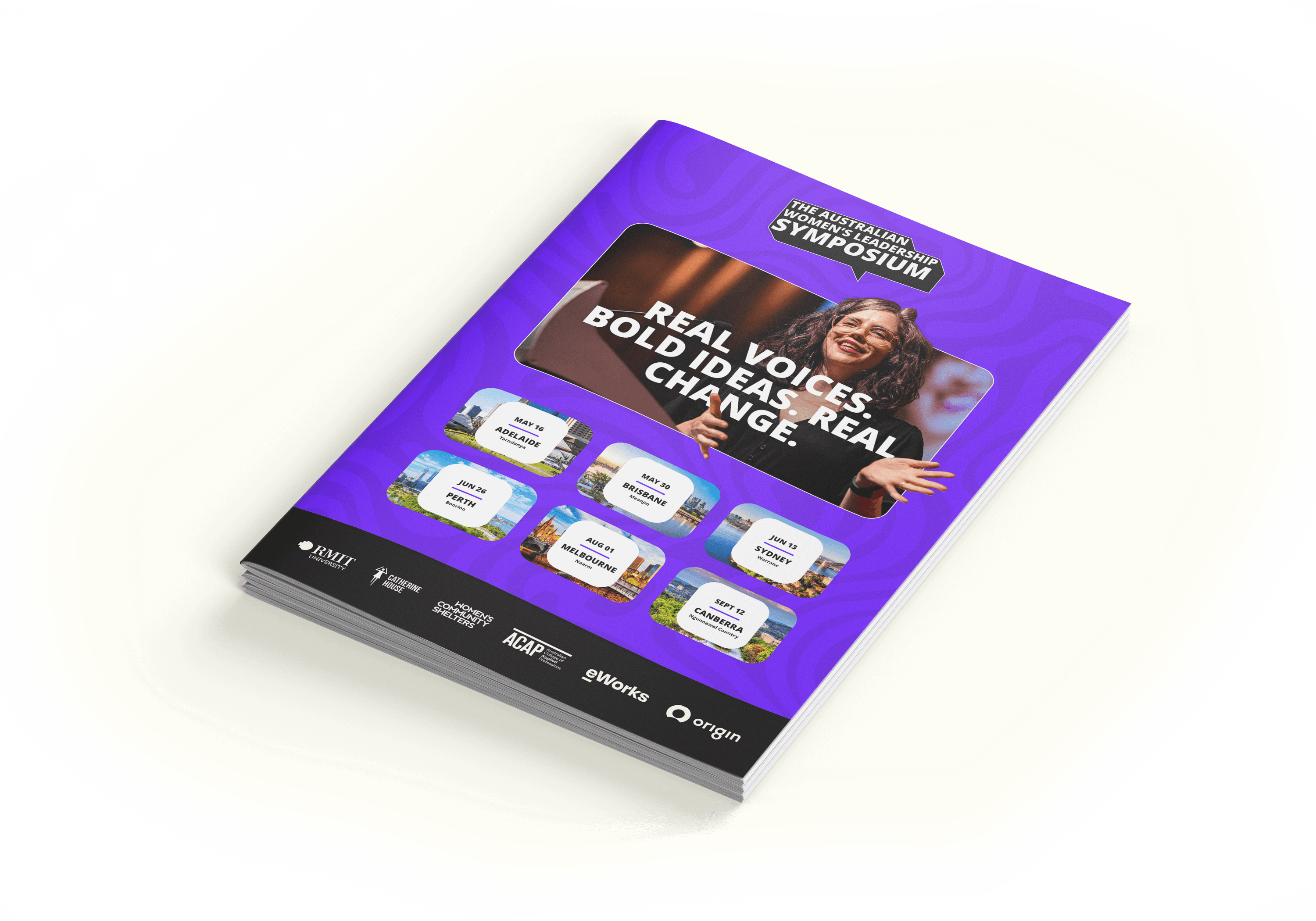
Website & Social Media
Website & Social Media
Website & Social Media
The goal was to capture the spirit of the Symposium: bold, human, and packed with creative energy. I wanted to break away from the corporate mould and build something that felt inspiring, personal, and evoke the transformative impact of this event. Reflecting not just what the event is, but how it feels.
The goal was to capture the spirit of the Symposium: bold, human, and packed with creative energy. I wanted to break away from the corporate mould and build something that felt inspiring, personal, and evoke the transformative impact of this event. Reflecting not just what the event is, but how it feels.
The goal was to capture the spirit of the Symposium: bold, human, and packed with creative energy. I wanted to break away from the corporate mould and build something that felt inspiring, personal, and evoke the transformative impact of this event. Reflecting not just what the event is, but how it feels.
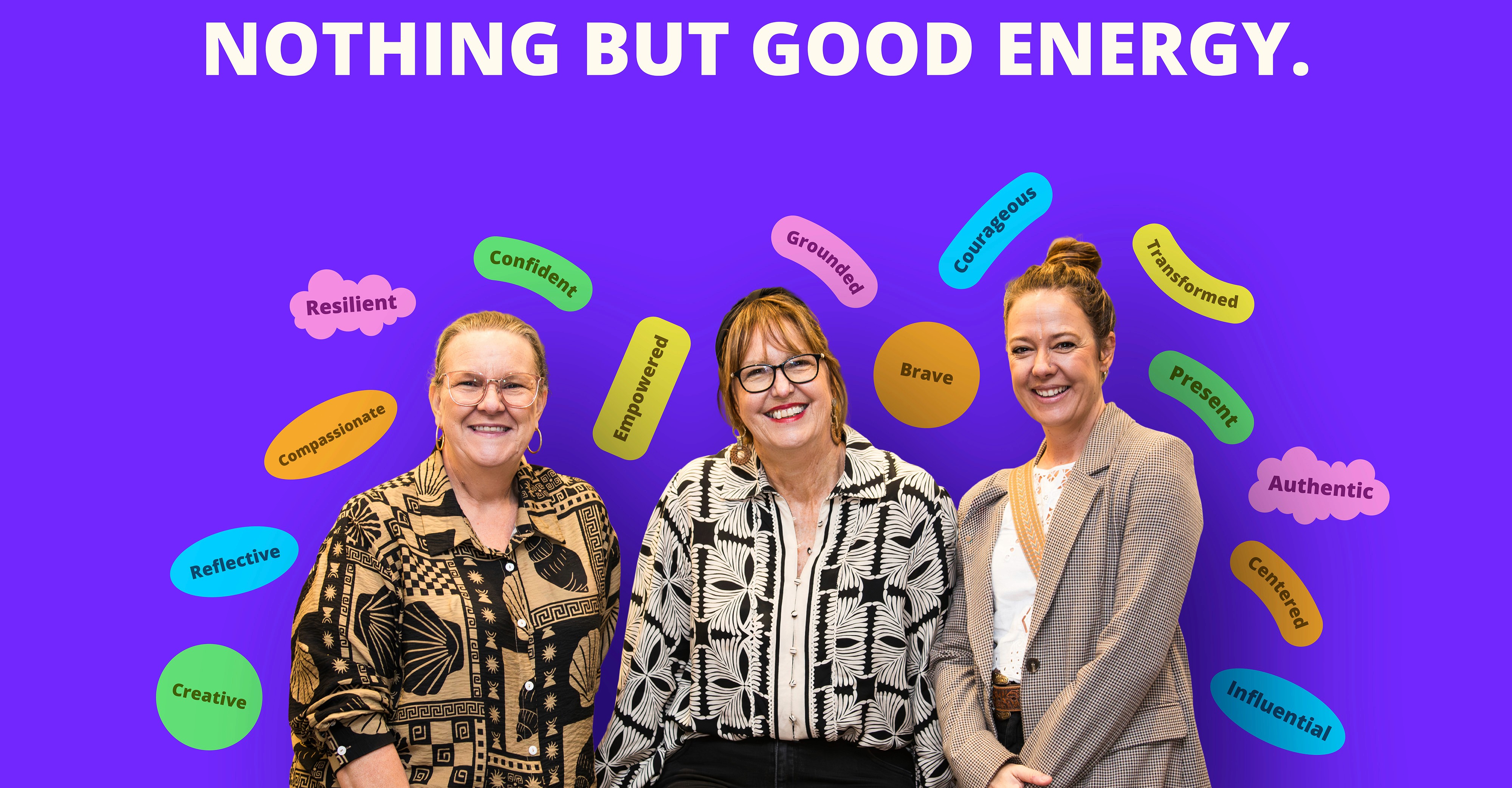
The digital ecosystem includes a landing page, six individual agenda pages, and six stores. I also designed a collection of social media assets using vibrant colours and candid photos from past events, capturing both audience engagement and the speakers' energy. At the end of each Symposium, attendees are asked to describe how they feel in one word. I transformed these emotional responses into a dynamic word cloud that distils the event’s atmosphere. Together, these pieces form a cohesive and expressive identity that informs, inspires, and connects.
The digital ecosystem includes a landing page, six individual agenda pages, and six stores. I also designed a collection of social media assets using vibrant colours and candid photos from past events, capturing both audience engagement and the speakers' energy. At the end of each Symposium, attendees are asked to describe how they feel in one word. I transformed these emotional responses into a dynamic word cloud that distils the event’s atmosphere. Together, these pieces form a cohesive and expressive identity that informs, inspires, and connects.
The digital ecosystem includes a landing page, six individual agenda pages, and six stores. I also designed a collection of social media assets using vibrant colours and candid photos from past events, capturing both audience engagement and the speakers' energy. At the end of each Symposium, attendees are asked to describe how they feel in one word. I transformed these emotional responses into a dynamic word cloud that distils the event’s atmosphere. Together, these pieces form a cohesive and expressive identity that informs, inspires, and connects.


Designed for the Moment. Meant to Last.
Designed for the Moment. Meant to Last.
Designed for the Moment. Meant to Last.
Event Workbooks
Event Workbooks
Event Workbooks
The workbooks are designed as thoughtful companions to the Symposium experience. They guide attendees through the day, help them stay present, and give them space to capture the ideas, reflections, and sparks of inspiration they want to carry forward. Each one is meant to be held onto.
The workbooks are designed as thoughtful companions to the Symposium experience. They guide attendees through the day, help them stay present, and give them space to capture the ideas, reflections, and sparks of inspiration they want to carry forward. Each one is meant to be held onto.
The workbooks are designed as thoughtful companions to the Symposium experience. They guide attendees through the day, help them stay present, and give them space to capture the ideas, reflections, and sparks of inspiration they want to carry forward. Each one is meant to be held onto.
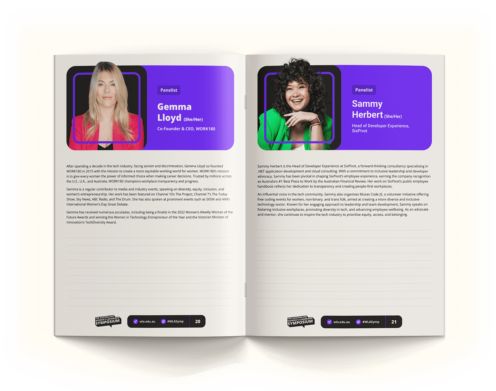
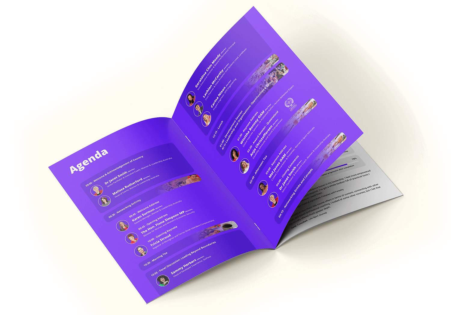
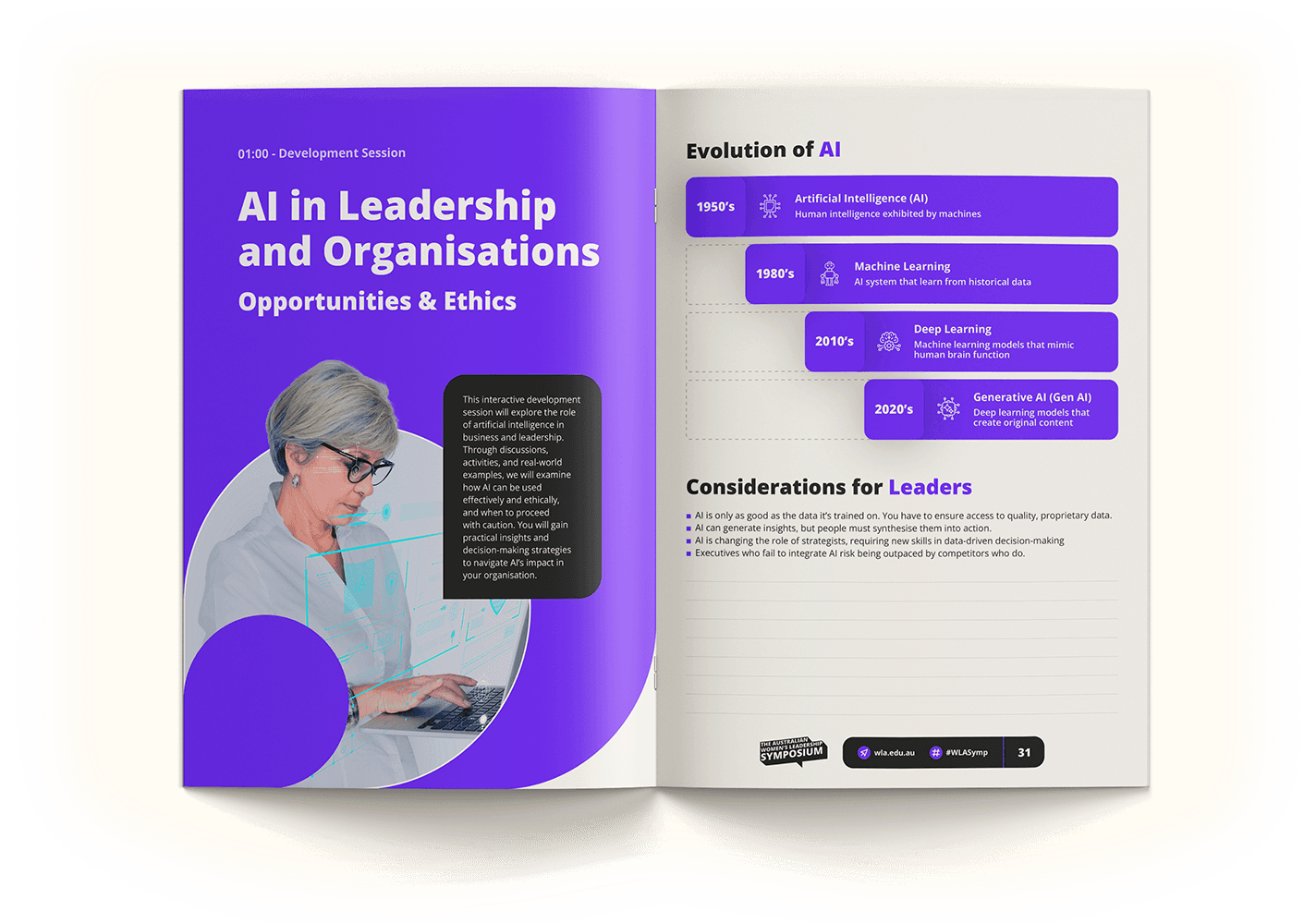
Each event has its own 50-page workbook, given to attendees on the day. It includes the full agenda, dedicated pages for each speaker, space for personal notes, and editorial content about WLA’s mission, values, and programs. Designed to follow the rhythm of the event, the workbooks support learning in the moment and serve as a meaningful keepsake, something attendees can revisit long after the day ends.
Each event has its own 50-page workbook, given to attendees on the day. It includes the full agenda, dedicated pages for each speaker, space for personal notes, and editorial content about WLA’s mission, values, and programs. Designed to follow the rhythm of the event, the workbooks support learning in the moment and serve as a meaningful keepsake, something attendees can revisit long after the day ends.
Each event has its own 50-page workbook, given to attendees on the day. It includes the full agenda, dedicated pages for each speaker, space for personal notes, and editorial content about WLA’s mission, values, and programs. Designed to follow the rhythm of the event, the workbooks support learning in the moment and serve as a meaningful keepsake, something attendees can revisit long after the day ends.
Accessibility Checklist Initiative
Accessibility Checklist Initiative
Accessibility Checklist Initiative
Designing for everyone
Designing for everyone
Designing for everyone
I initiated this project with the goal of setting a new standard for how accessibility is approached and communicated at our events. More than a tick-box exercise, the checklist was designed to spark deeper reflection from venues. Not just “are you wheelchair accessible?” but “Is the entire experience dignified and inclusive?”
I initiated this project with the goal of setting a new standard for how accessibility is approached and communicated at our events. More than a tick-box exercise, the checklist was designed to spark deeper reflection from venues. Not just “are you wheelchair accessible?” but “Is the entire experience dignified and inclusive?”
I initiated this project with the goal of setting a new standard for how accessibility is approached and communicated at our events. More than a tick-box exercise, the checklist was designed to spark deeper reflection from venues. Not just “are you wheelchair accessible?” but “Is the entire experience dignified and inclusive?”
From assessing accessible parking options to highlighting sensory considerations or breastfeeding rooms, the form encouraged venues to truly interrogate their spaces. I then translated their responses into a clear, honest checklist published on our website so attendees could prepare with confidence. Just as important as what’s accessible is what isn’t, and making both visible was key to creating a more transparent, stress-free experience for everyone.
From assessing accessible parking options to highlighting sensory considerations or breastfeeding rooms, the form encouraged venues to truly interrogate their spaces. I then translated their responses into a clear, honest checklist published on our website so attendees could prepare with confidence. Just as important as what’s accessible is what isn’t, and making both visible was key to creating a more transparent, stress-free experience for everyone.
From assessing accessible parking options to highlighting sensory considerations or breastfeeding rooms, the form encouraged venues to truly interrogate their spaces. I then translated their responses into a clear, honest checklist published on our website so attendees could prepare with confidence. Just as important as what’s accessible is what isn’t, and making both visible was key to creating a more transparent, stress-free experience for everyone.


Form sent to venues
Form sent to venues
Form sent to venues

Instagram Explanatory Reel
Instagram Explanatory Reel
Instagram Explanatory Reel

Checklist as seen on website
Checklist as seen on website


Anja Christoffersen
Anja Christoffersen
CEO of the Women with Disabilities Entrepreneur Network (WDEN)
CEO of the Women with Disabilities Entrepreneur Network (WDEN)
I was very impressed by how clearly you showed the accessibility aspects available, it's absolutely the best way I have ever seen it presented!!
I was very impressed by how clearly you showed the accessibility aspects available, it's absolutely the best way I have ever seen it presented!!